

Interiors Column - August/September 26
Fear Of The Dark
For decades, homeowners were told the same thing: if you want a room to feel bigger, brighter and more open, paint it white. Yet interior designers are increasingly turning that logic on its head. Done correctly, darker walls can actually make a space feel lighter, warmer and far more sophisticated.
At first glance, it sounds completely counterintuitive. Surely deep charcoal, navy or forest green would make a room feel smaller or more enclosed than soft neutrals or brilliant white? In reality, colour psychology and the way light behaves inside a room tells a very different story.
One of the biggest mistakes people make with white walls is assuming they automatically create brightness. In fact, white paint often reflects every available tone in a room… that includes grey skies, shadows and other sombre elements present in the home environment.
In north-facing rooms, where natural light is often cooler and bluer, bright white can sometimes leave a space feeling flat, clinical or even slightly gloomy.
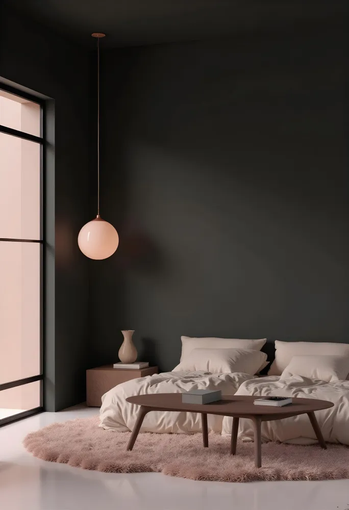
Dark colours behave differently. Rather than aggressively bouncing light around, deeper tones absorb it, creating contrast, depth and visual richness. This can make natural light sources stand out more dramatically – think windows, lamps, mirrors and metallic finishes. In other words, the dark background allows the brighter elements in a room to work harder.
Deep navy is often one of the safest starting points. It has the sophistication of black without feeling harsh, and works beautifully with brass lighting, cream upholstery and natural oak furniture.
Forest green has also become a favourite in British interiors, particularly in living rooms and dining spaces. Paired with warm lighting, tan leather, houseplants and off-white soft furnishings, it creates a grounded, calming atmosphere that feels luxurious.
Charcoal grey offers another practical option. Combined with pale woods, textured throws and oversized mirrors, it creates an elegant contrast while allowing metallic accessories or artwork to become focal points.
Lighting is absolutely crucial when working with darker walls. Warm bulbs help prevent rich colours from feeling heavy or cold, while layered lighting also makes a huge difference. So that means table lamps, floor lamps and wall lighting being used to create pockets of warmth, at the same time preventing shadows from dominating the space.
Texture matters too. Matt paints tend to create softness and sophistication, while velvet cushions, woven rugs, linen curtains and ceramic accessories stop darker schemes from feeling one-dimensional.
Perhaps the most effective trick of all is balance. Dark walls work best when paired with lighter ceilings, strategic mirrors and carefully chosen accent colours – so go with cream, blush pink, burnt orange or soft gold.
Far from making a room feel darker, the right deep shade can create something far more valuable: atmosphere.


